I made my artwork ‘twinkle’ with the the animation tool in Procreate.

Here’s how


I exported mine as an MP4 in order to play on Instagram.
A bit of fun for a Friday! 🙂
I made my artwork ‘twinkle’ with the the animation tool in Procreate.
I exported mine as an MP4 in order to play on Instagram.
A bit of fun for a Friday! 🙂
I’ve been learning Illustrator for 3 weeks. It feels like longer!
It’s a massive program, which I doubt I will have scratched the surface of, even after a year of study.
After beginning on my laptop, I quickly moved onto the iPad in order to draw more easily with the Apple Pencil. It was learning all over again at first!
There are no where near as many visual windows or options as the desktop version. It was like treasure hunting without a map: There is no ‘place’ option, I couldn’t find the eye dropper, where was the keyboard?
I had a hairy few days of frustration as workflow slowed. I didn’t want to go between laptop and iPad all time, I knew it shouldn’t be this time consuming.
And it isn’t. A bit of google and play time and I’m finding my feet with the iPad version. As someone who hand draws much of what I design, I love it.
I’m no way qualified to give any sort of tutorial, but there are some great YouTube tutorials which are really helpful with getting started.
After 6 months of procrastination, self depreciation and future tripping, I joined a course in Surface Pattern Design.
Before clicking ‘pay now’, I read Marie Forleo’s ‘Everything is figureoutable’ from cover to cover. It gave me the kick up the arse I needed to follow my dreams. Every time I get the ‘I’m not good enough, I can’t do this’ jitters, I remind myself that EVERYTHING IS FIGUREOUTABLE.
I have joined Rachel Taylor‘s ‘Make It In Design’ course, and I’ll be blogging about my progress, ups, and now doubt downs!
Plus keeping myself accountable!
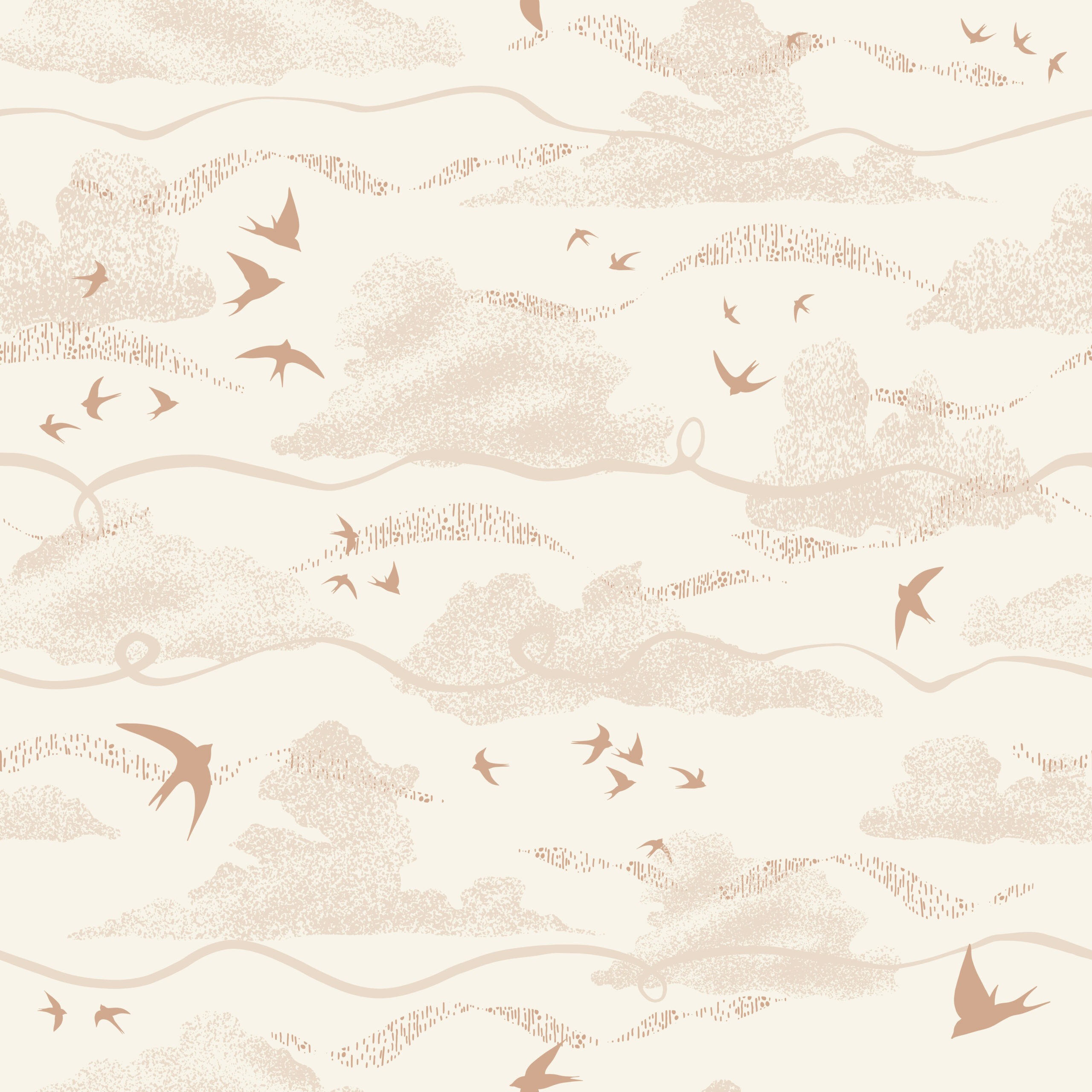
Here is my first go at pattern making.
I drew the motif in paper and then in procreate. Then I created the pattern in Photoshop.
The scratchy textures were created with a dry paintbrush and poster paint (literally out of my 7 years old’s art box), scanned and added into Photoshop. I experimented with blending modes until I found something I liked. 🙂
I’ve been creating on my iPad this week, using Procreate.
I find creating surface patterns quite therapeutic.
What do you do to switch off?
Take care,
Michelle
I’ve been experimenting with watercolours and fine liners lately.
With the lockdowns and fading light, photography has become more and more difficult. I love being creative and wanted something I can do in my house, on my own, whenever I have a spare moment.
I’ve been exploring these two media, both very new to me. There is so much variety in the art store – it’s difficult to know where to start!
So I started by drawing and painting the same thing, over again, using different pens, brushes and paint mixtures, to see what I liked.
Once happy with a technique, I then reproduced it on watercolour paper (more expensive than the cartridge paper I was using, so not for experimenting!)
I used a size 4 brush for this. It has a lovely fine point so I can use it for some finer details as well
I first created the dandelion in Procreate on my iPad. I then wanted to see what it would look like painted.
That’s what I’ve been up to lately, and some drawing.
Have you learnt any new creatives skills lately?
Take care,
Michelle
The RISE International Photography Awards is a unique, online photography awards system aimed at seeing entrants elevate their work from one award year to the next.
The judges gave written feedback to all entrants on all photos entered. I entered three images into three categories: Maternity, Family and Creative.
My entry for the creative category was the first image from my ‘Daughter of Woman’ series, entitled –Daughter of Woman.
I hadn’t created any other images in the series at the time of entering the competition.
I had no idea how the judges would respond to this type of image, but the early bird entry fees weren’t expensive and I was curious as to what they would say about it.
This is quirky and very cool; I love the repetition between the flower-head and the pattern on the shirt, and it’s even echoed in the background. To improve it, be careful on the masking for the glass dome-thing; there are some portions where the masking could be cleaner. It’s easiest to see the masking issues along the top left edge of the glass where it is in front of a shadowed bit of wall. The focus control on the shirt, the glass, and the background is really good, well done.
The image has great impact that grabs your attention.
A well developed and executed creative concept.
Overall a very interesting concept. Lovely use of patterns to create an intriguing composition.
I’m so cross with myself for not spotting the masking issue! It just goes to show how useful a second pair of eyes and professional review can be!
I’m going to post the feedback from my family entry soon.
Take care,
Michelle